№ 05 · 2026 · open source
CorneaDev Mono
A monospace face for developers whose close-up vision has started to argue with small type
- optimised for
- 10–16pt
- skeleton
- grotesque
- licence
- ofl-1.1
- built with
- python
- font style
- monospace
- language
- python
- last commit
- 2026-07-05
- stars
- 1
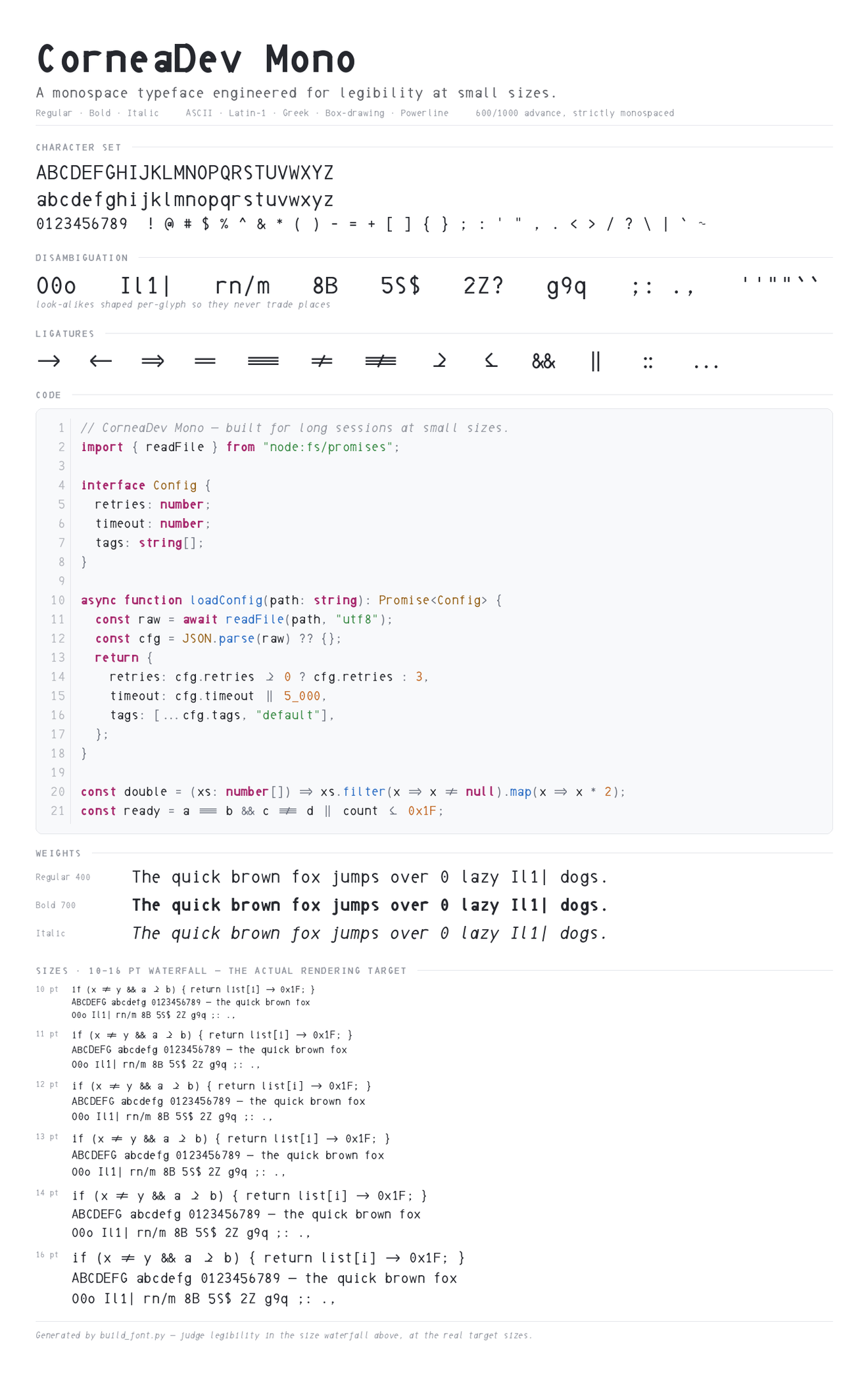
CorneaDev Mono is designed for a developers with presbyopia, the age-related loss of near focus that arrives around forty. Over time, it becomes harder and harder to distinguish between characters - at small sizes they become blurry. This font is not designed to be attractive, it’s trying to keep letters distinguishable at normal sizes for developers.
Open apertures on the a, e and c are the single best-supported choice in the face: closed openings fill in and smear into their neighbours under blur and crowding, where open ones hold their identity. The look-alikes that cause real bugs — 0 and O, 1 and l and I and |, 8 and B, rn against m — are shaped per glyph rather than treated uniformly, because they fail for different reasons. Serifs appear only on the troublemakers, at the vertical extremes where stroke contrast is uniform, and nowhere else.
The system also uses a tall x-height with generous, even spacing, and monospace gives you the spacing for free. It is a utility typeface, it’s designed for small-size legibility instead of beauty.